A Full Cycle Design Process Study
Applying the end-to-end design process resulting in a mobile service concept

Role
Research Insights,
Ideation,
Final UI Lead
tools
Figma, Canva
YEAR
2024
The Problem
It’s hard to keep friendship burning while navigating major life changes.
Your twenties are a decade of change, but with career pressures, moving to new cities, and navigating evolving romantic relationships, maintaining close friendships can become a real challenge. Young adults need a meaningful way to continuously feed the fire of their closest friendships as they navigate major life changes.
As part of a Master’s-level Fundamentals of UX course, our group project explored how digital experiences could help young adults stay connected and nurture meaningful friendships during this transformative decade.
How might we support and fuel connections despite distance and busy schedules?
The Solution
A platform to spark connections through photos and music.
Based on our research and insights into young adults’ friendship challenges, we designed a mobile experience to support meaningful connection. The solution centered on:
Streamlining interactions to make staying in touch effortless
Highlighting key social touchpoints to encourage consistent engagement
Balancing usability and emotional resonance, so the app felt supportive and intuitive
Our approach involved iterative design cycles, using wireframes and prototypes to test assumptions and refine features based on feedback. The final app, LuminUs, is the outcome of this user-centered, iterative process, ensuring that it addresses real user needs while supporting our design objectives.
My Role:
Conducted research to identify key features that drive effective digital experiences
Interviewed participants to uncover behaviours, needs, and pain points
Synthesized insights to reveal patterns and inform design decisions
Led collaborative ideation workshops to generate user-centered solutions
Designed the final UI and produced high-fidelity deliverables aligned with user needs and project goals
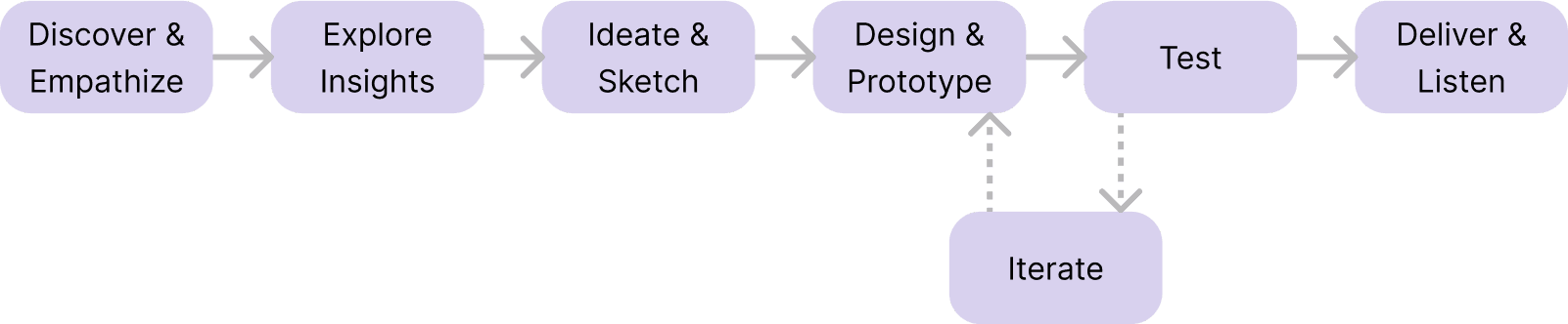
Process
The iterative design process lit our way.
To address the challenge of helping young adults maintain meaningful connections, our team followed a full UX design cycle.
Here’s a quick overview of our end-to-end process:
Problem Definition
Current social media apps are cold with engagement.
Competitive Analysis
While there are many social networking platforms available, we wanted to understand whether they truly meet the needs of young adults trying to maintain meaningful connections. We analyzed key competitors: BeReal, Locket, Instagram, and Snapchat to identify patterns in features, interaction styles, and engagement strategies.
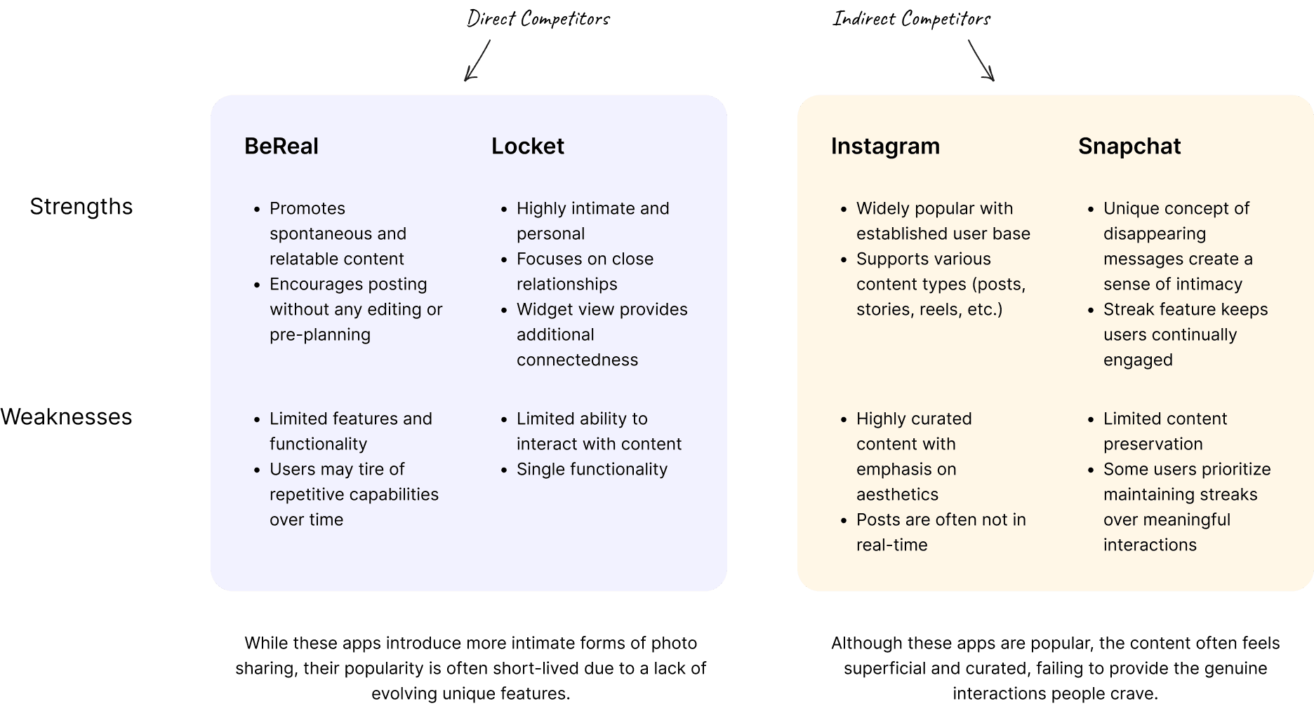
This research highlighted the need for a social experience that prioritizes authenticity and thoughtful engagement, supporting users in maintaining truly meaningful connections with friends.
User Interviews
We interviewed eight young adults to kindle insights into their views on friendships.
To design a solution that truly supports meaningful connections, we sought to understand what makes friendships fulfilling and how digital habits either help or hinder these connections.
We focused on young adults in their twenties who had experienced a major life event in the past two years that impacted their ability to stay connected with friends.
Objectives for 1:1 interviews:
Identify key pain points participants face in maintaining friendships
Understand which types of interactions feel most meaningful
Explore sentiments around reaching out and initiating contact
Learn how participants currently use digital tools and apps to stay in touch
Findings & Analysis
People desired authentic updates but struggled to ignite conversations.
Affinity Map
After conducting the interviews, we captured each major finding on a sticky note and grouped insights by similarity and topic. I led the analysis around the nuances of digital interactions, uncovering patterns in how young adults maintain friendships online.
Key themes that emerged:
Intimate social circles matter: Participants prefer staying updated with a small group of close friends rather than large social networks, valuing quality over quantity.
Desire for authenticity: Many seek more unfiltered, real updates from friends instead of curated or staged content.
Hesitation to reach out: Participants often worry about bothering friends, which can prevent them from initiating meaningful interactions.
These insights directly informed our design approach, highlighting the need for a platform that supports intimate, authentic connections while reducing friction in reaching out.

Based on our research insights, we identified three core opportunities for the solution:
Support intimate connections: Prioritize small-group dynamics to help users focus on their closest friends and strengthen meaningful bonds.
Promote authentic sharing: Encourage spontaneous, unfiltered content that reflects real-life moments rather than curated updates.
Lower friction in communication: Facilitate effortless conversation starters to reduce anxiety around reaching out and keep interactions flowing naturally.
These opportunities guided every aspect of our design, ensuring that the app addressed the real needs and behaviours of our target users.
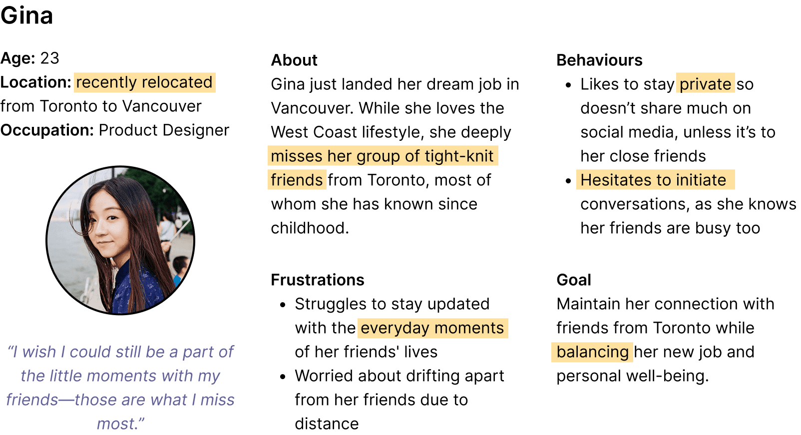
User Persona
Meet Gina.
With our research insights in hand, we synthesized the findings into a representative user persona to guide design decisions and ensure the solution met real user needs.
Meet Gina: A young professional navigating a new job in a new city, while striving to maintain the friendships that matter most. Gina embodies the challenges, motivations, and behaviours we observed across our target audience.
Ideation
We needed to fuel connections that were easy to spark and intentionally sustained.
From the beginning, we knew we wanted to develop a concept that resonated deeply with the emotional essence of close friendships.
To kick off the ideation phase, we used the Crazy Eights method, a rapid brainstorming technique where each team member sketched eight ideas in eight minutes. This method encouraged quick, creative thinking and helped us generate a wide range of concepts—ranging from practical solutions to bold, imaginative ideas—each aimed at fostering meaningful connections.
As the studio lead, I facilitated the prioritization of features based on user insights, feasibility, and alignment with project goals. This process allowed us to identify the concepts with the highest potential to address real user needs and set the foundation for our final design. In the end, these were the standout concepts:

While seemingly non-related, these ideas all highlight a common theme of enabling easy but intentional connections between friends, creating a tangible sense of presence even when far apart.
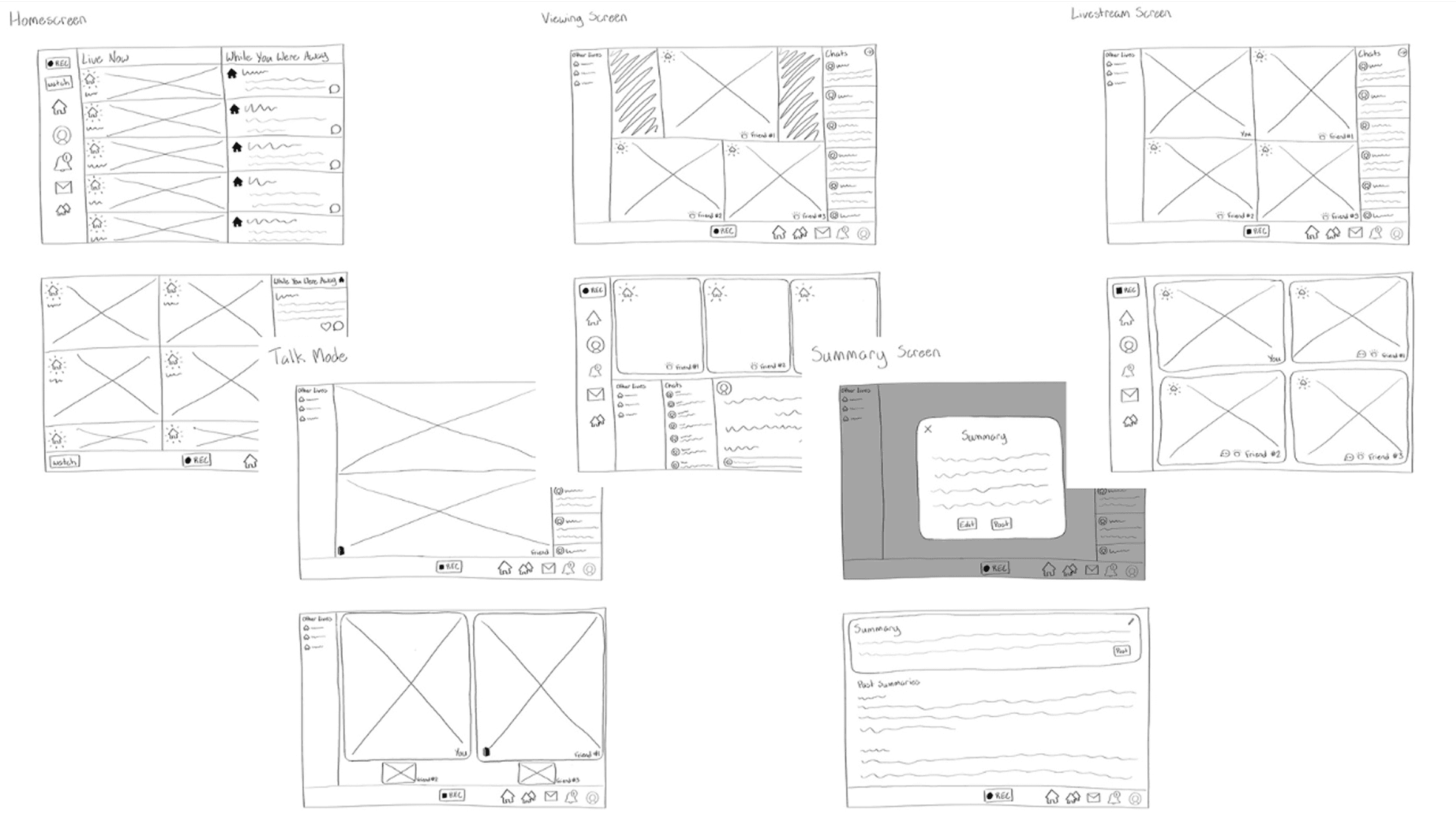
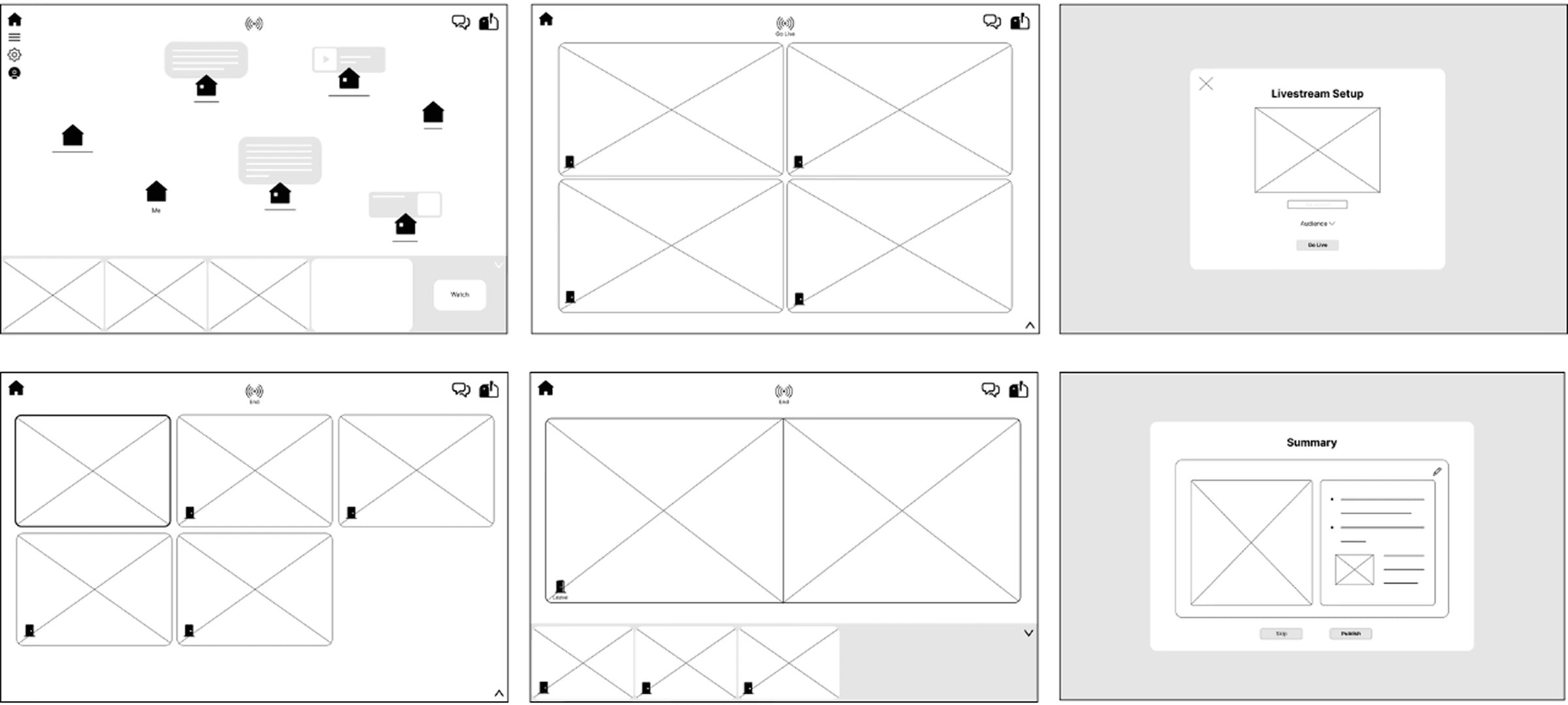
Sketches & Wireframes
Initially, we set out with a goal to fuel the essence of a physical neighbourhood.
The neighbourhood concept resonated deeply with our team, so we set out with ambitious goals to re-create the essence of a physical neighbourhood in a digital environment where users who lived far apart could still feel as if their friends were right next door.
Through this platform, Gina can:
Livestream to her close friends from Toronto when she feels lonely
View the livestreams of all her friends at once, creating a sense of togetherness
Talk one-on-one with a friend when desired
To bring this idea to life, I created sketches and low-fidelity wireframes, mapping out the core interactions, flows, and layouts that would support authentic, effortless connection for our users.
Usability Testing
We needed a solution that would ignite comfort.
After testing our initial Neighbourhood concept and gathering feedback from users and experts, we identified several critical issues and design gaps:
Livestream discomfort: Many users felt uneasy being on camera, highlighting the need for more flexible, low-pressure ways to share moments.
Conversation barriers: The design did not address users’ hesitations in initiating interactions, leaving an important pain point unresolved.
Onboarding confusion: First-time users found the interface difficult to navigate, reducing clarity and accessibility.
Platform mismatch: Desktop usage was lower than expected, emphasizing the need for a mobile-first experience.
These insights informed a pivot in the design approach, prompting us to rethink how we could support authentic connection without creating friction or discomfort, while ensuring the experience felt intuitive, mobile-friendly, and user-centered.
We saw that a shift in our solution was necessary, but we were determined to preserve the heart of the neighbourhood and its sense of community through a digital experience.
Through the feedback, we now knew that our solution needed to do the following:
Comfortable, accessible content: Introduce forms of interaction that feel natural and low-pressure for users, removing barriers to participation.
Effortless conversation initiation: Include features that support spontaneous, low-stakes outreach to reduce anxiety around connecting.
Clear, familiar interface: Use intuitive icons paired with text labels to make common functions immediately understandable.
Mobile-first design: Prioritize a mobile experience to meet users where they naturally engage with social platforms.
The Creative Process
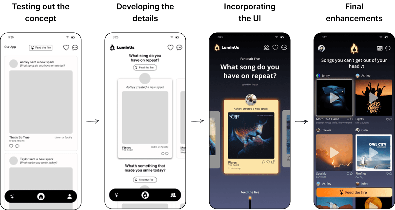
We unintentionally sparked a design probe.
With time running out, we decided to take on a unconventional approach to solutioning. Rather than starting solely from features, we let the desired look and feel of the interface guide and inspire design decisions, ensuring alignment with the core metaphor of a connected digital community.
Through this process, we developed a mood board that captured the tone, style, and visual language of the app:

For the UI, our goal was to capture the warmth, intimacy, and sense of togetherness of sitting by a campfire under a starry night with your closest friends. Every design choice, from color and typography to iconography and layout, was intended to evoke this feeling and reinforce meaningful social connection.
Through multiple rounds of brainstorming, prototyping, and feedback gathering, the concept of LuminUs emerged. I collaborated closely with Chen to design, refine, and iterate on the high-fidelity prototype, ensuring the experience was:
Emotionally resonant: Reinforcing the warmth and closeness of friendships
User-centered: Addressing pain points such as conversation anxiety and accessibility
Intuitive and engaging: Guiding users naturally through the app’s key flows and interactions
This iterative process allowed us to translate insights, metaphors, and research findings into a polished, emotionally engaging digital experience.
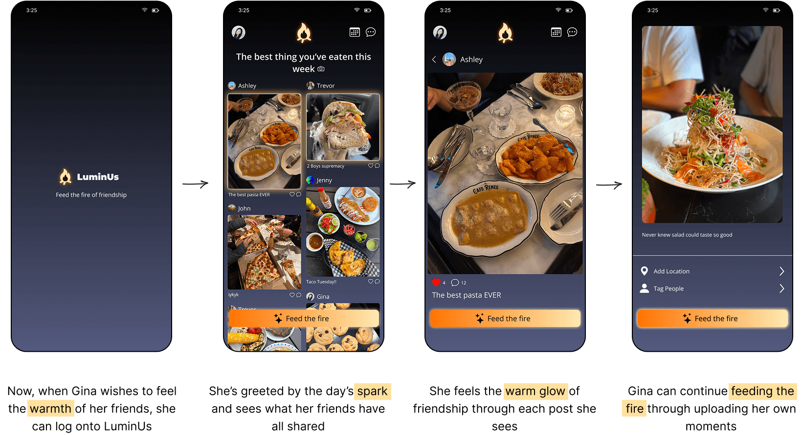
The Final Result
LuminUs helps Gina keep the flames of her friendships thriving with small, meaningful gestures.
As the studio lead for the UI finalization and solution presentation, I ensured that every screen of our LuminUs prototype:
Reflected core user needs, addressing pain points uncovered during research
Integrated iterative feedback from usability testing and peer reviews
Included polished visual details and micro-interactions to enhance clarity, engagement, and emotional resonance
Reflection
Fuel solutions by deeply understanding the problem and target audience.
This project reinforced the value of user-centered design, iteration, and a strong conceptual framework:
The Importance of Iteration and Pivoting: Real user feedback and usability testing revealed opportunities to improve beyond our initial vision. I learned that pivoting—adjusting features, interactions, or even the overall solution—is essential to creating a product that truly meets user needs.
The Power of a Strong Design Vision and Metaphor: Using the fire and neighbourhood metaphors gave the app emotional resonance and a consistent narrative. A strong conceptual framework not only guides design decisions but also helps users intuitively understand the app’s purpose and functionality.
Focused Problem Definition is Key: If starting over, I would dedicate more time to narrowing the target audience and clarifying their specific needs. A well-defined problem upfront can streamline the solution, reduce unnecessary iterations, and ensure that the design process remains tightly aligned with user and business goals.
Overall, this project reinforced that deep user understanding, iterative design, and conceptual clarity are critical to creating meaningful and impactful digital experiences.
